Redesigning the dating interface
Before the redesign

After the redesign

Design brief:
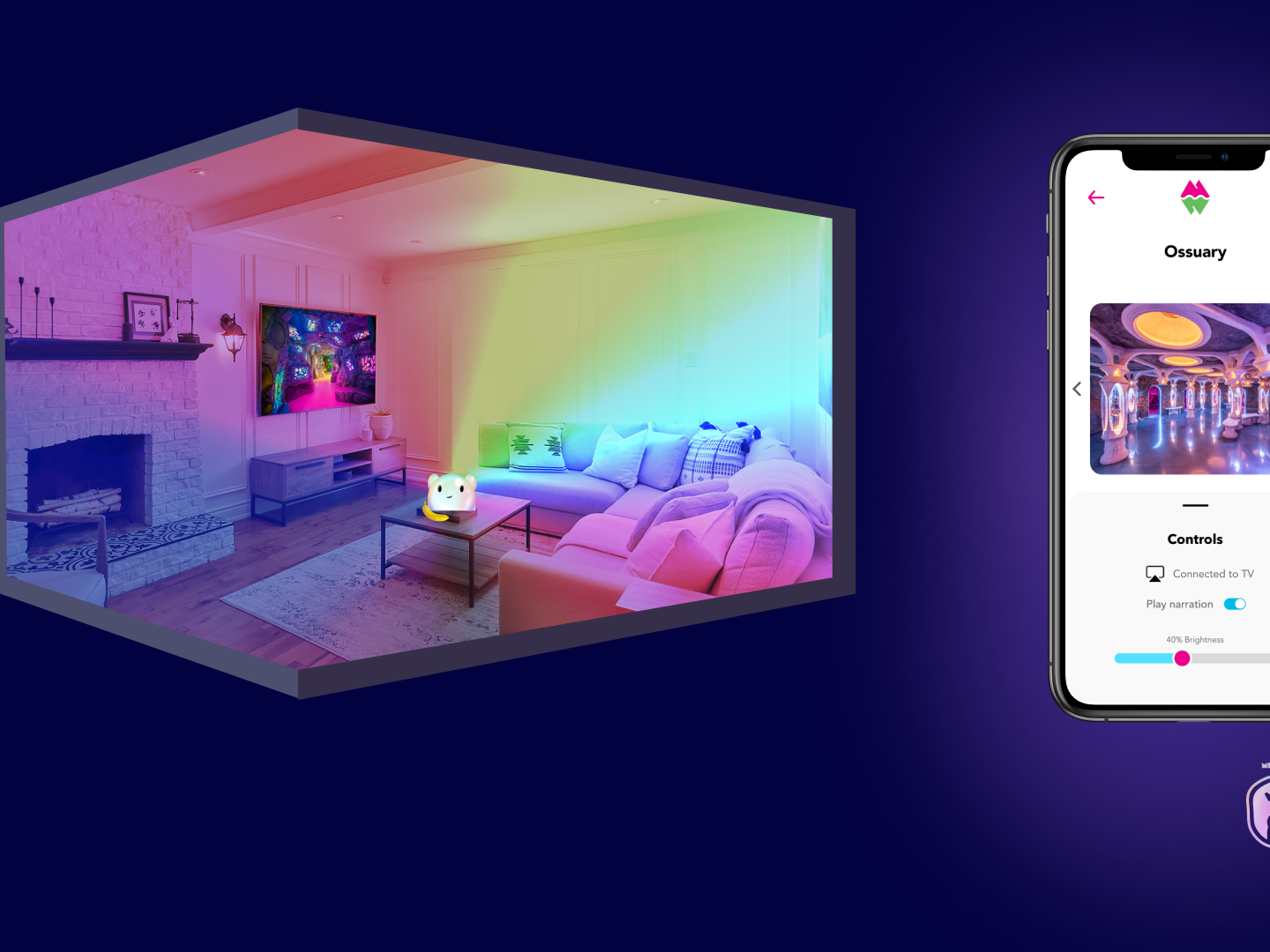
Hiyoume is the first video-based relationship app for Generation Z. Built for the creator economy, hiyoume produces and features creator-hosted interactive content that is designed to lead to genuine online connections. Users can participate in video question challenges that express their personality and can tailor their audience for sharing with friends or potential dates. That’s why Hiyoume is not a dating app, because it is so much more: it’s a whole new way to meet, date, and connect. Hiyoume lets you do more, together.
Design challenge:
Dating app’s users are fatigued, and done with both ‘Swipe’ and ‘Like’ culture, that currently exists in today's dating apps as ways to match with other users. This reputation has led to demoralized users, often saying they hate dating apps or it feels like a job.
Solution:
Getting rid of the "like" feature by encouraging users to "flame" and send "rose" videos to standout from the crowd
Research
The first thing that had to be done was to compile research of what is working in dating apps today and what isn't. This research will not just inform us of the pros and cons of apps but what we can potentially do to further the experience and technology.

TINDER
When looking into Tinder I quickly noticed that it is the poster child of the swiping culture we want to get rid of.
+ The user swipes left when they don't like the user and swipes right when they do.
+ To go through the user's images; you click the area to the right or the area to the left.
+ To view their whole profile; you click on the area by their names.
+ Tinder has other buttons users can click on to "standout" when liking another user but this is where it gets into paywalls and subscriptions.
+ When you match with another user the screen vibrates and a match modal appears filling up the whole screen. The user can still swipe through their new match's content in this window.
Bumble is interesting. The same mechanic of swiping left for "no" and right for "yes. But what was appealing was their scrolling feature to get to know the user.
+ Swipe right/left feature to match with other users.
+ Bumble picks the user's best photo to display first on their swipe profile.
+ The scrolling feature allows users to get to know each other better instead of basing it on looks and pictures.
+ When you match with a user a simple match screen appears displaying your photo with the other user.

BUMBLE

SNACK
Snack is a very simple App that is also purely video-based dating.
+ Same swiping mechanic.
+ Only videos.
+ Can't unlock matches without inviting friends.
+ Has a chat feature but can't use it until you get a match. Can't get a match unless you do the above.
+ Too simple it's not that fun or appealing.
Inspiration


Insights
Hiyoume has a scrolling feature to look through different profiles and a few features to set dating preferences as well as a heart.
What makes it different and what can further the experience so it can stand out from the crowd?
How might we enhance the experience?
Ideas:
+ Improve the UX/UI to compete with other apps on the market.
+ Getting rid of the "heart" completely to move away from the "liking" culture in dating.
+ Move forward flames and roses
+ Incorporating video to matching
+ Designing a "it's a match" screen that pops out to the user but doesn't disconnect them from the experience.
Mechanics
Before beginning the prototyping phase, we had to determine what a "flame" is and what a "rose" would be in the future. As well as tackling questions regarding these functions.
Questions
If I flame you and you heart me, is it still a match?
Taking the heart feature away brings up the following question->
What is a flame? How is it different from a heart or a rose?
A flame goes deeper than a heart, it's not just a "like", it's the user telling this other user "I don't just "like" you, I want to create a genuine connection with you".
A rose needs to be something more, this is the equivalent of a "super like" for Tinder but much more. This will help the user stand out from the crowd. The solution? = A rose is a video you send to this potential match.
When you match with a user, does it require a different pop-up/screen or the same?
Will users be able to tell the difference? How do we design it so that the user either learns really quickly or understands it right away?
Prototype
First task: Improve "It's a match" experience

OLD

IDEATION
We quickly realized that "it's a match" screen couldn't be as simple as a modal window. It needed to appeal to the user and impact them in a positive way. This is why we moved from a modal window to a full screen experience.

NEW

IMPROVED
In this version, The heart is animated and beating
The most recent video of the user is playing in the background and you are able to swipe through their videos or Can Press the “x” in the corner to leave.
The most recent video of the user is playing in the background and you are able to swipe through their videos or Can Press the “x” in the corner to leave.
This version wasn't used considering we opted out of using hearts and wasn't exactly what we were looking for.
In this version, the idea was to put the first video of each user side by side and playing while an animated "it's a match" text is showing in the foreground. The user is able to send them a message or share a video with them.
This version wasn't chosen because of the potential of being too overwhelmed by the videos synonymously playing in the background.
We opted for a full-screen experience, only showing the matched user's first video with a "It's a match" animated in bold text and color to stand out. The background displays falling "flames". By incorporating this new screen and getting rid of the modal window, we successfully improved the matching experience.


Second task: Improve modal windows in Swipe View

OLD

IMPROVED
Final prototype


The goal was to move away from the dark modals to lift the mood of the user experience. This was a quick and simple, but effective fix. The UI informs the user that they're out of flames and roses, and to come back in xx amount of time for more. By incorporating the "get more xx" we are designing for a potential paywall while still also giving users a reasonable amount of each element to use. Ex: 15 flames | 3 roses
Third task: Update Swipe View screen

OLD

IMPROVED

IMPROVED
For the improved version we wanted to explore a darker/sexier User Interface so we explored a dark background and (almost) full-screen view of profiles. Buttons were almost transparent and would activate a pop of color when the user "flames/ hearts" another user. This ideation was done before it was decided to completely get rid of "likes". With this design style, we decided to experiment further by adding the ability to see the user's full profile (first image to the right). This had a lot of potential, we saw the ability to add the user's favorite games or questions. It opened our minds to further growth but ultimately this wasn't the version we chose to move forward.
Final prototype


We decided to hold off on a darker UI and went back to the Original blue background. We made minor differences in the rounding of corners. Made the user card smaller and changed the name of this screen to "match". I created a flame and rose icon to match new UI. As seen, even minor changes transform the look of a screen immensely. These changes helped modernize the screens as well as other areas of the app.
We also went ahead and updated the standouts screen to match the updated "match" screen. This screen displays all users that have flamed or sent a rose to the user. Corner radius now matches the "match" screen. Here flames expire after 3 days and when you have 24 hours left, the badge changes colors. The thumbnails display the users profile picture and you are able to click on the picture to go to the users profile.